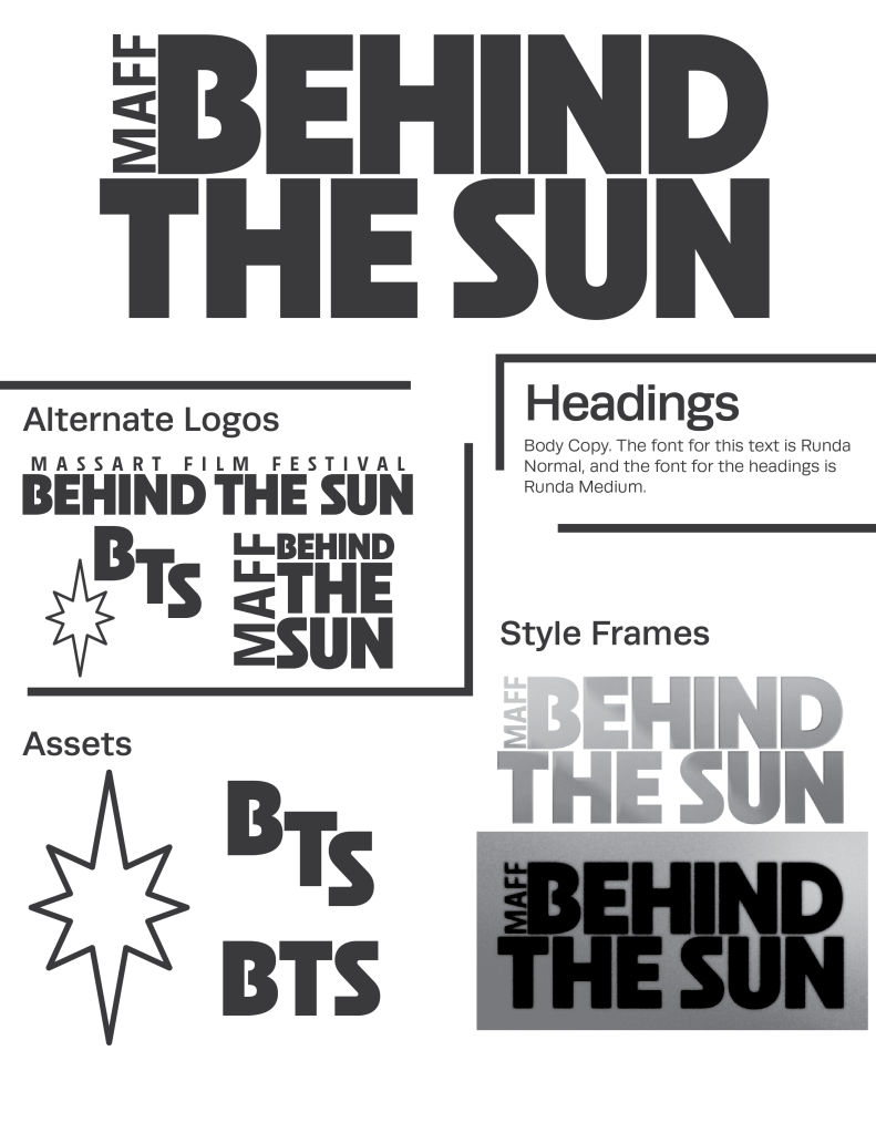
MassArt Film/Video’s 2024 graduating class voted on the title “Behind the Sun” for our Senior Thesis Show. That three word phrase was all I had to go on when I started crafting a visual identity.

This is the style page I submitted for a second round of voting. The stipulation was that these pitches could only be in black and white. I knew I also wanted to keep things relatively text focused so I could have the most room possible when I was figuring out an animation (which at this stage in the process I had no plans for). I used Neighbor through Adobe Fonts. It’s by a designer named Mark Caneso who’s work I find routinely inspiring. Never too extreme, but always more interesting than some safer choices. For my purposes, I loved the connected counters in the capital “B” and the symmetrical “S.”
One of the unexpected boons of staying so simple was the chance to change the layout of the logo while keeping a cohesive look. Every student had to include the name of the show on their poster, and I appreciated that I got to give them as many options as possible, so they could choose something that matched their film’s vibe.
The starburst glyph came from a desire to have some non-text element that could be used in other parts of the rollout that I wasn’t in charge of. It ended up working very nicely as stickers, on the left chest of a t-shirt, and as a piece of visual balance on posters that opted for the square logo. It makes a cameo appearance in the final animation.
When I was generating ideas for the title sequence, I started to think about telescopes and their relationship to camera lenses. The imagery of those circular, convex slips of glass allowing us to capture the world around us and view worlds that are impossibly far away felt enticing. Following down that thread lead me to most of the other decision I would make.
Starting with a sunset palette, I began crafting this minimalistic meteor shower look. The idea was that the action and density of the frame would increase until we hit a crescendo moment where we saw the sunrise and the logo.
I was also lucky enough to have the time to work with sound more than I usually do. In addition to a score, I tracked in summer night ambient sound to try to set that stargazing mood. It was also important to me that the glass feel monumental- heavy and dense as it pulled across the sky. I tried to bring that out in those sliding stone sounds.
One of the final challenges for this project was the creation of these quick intertitles. Every one of the 24 films in the festival has a unique set of comet animations and sounds. There was no quick way to do this, but I’m glad that I took the time. In my opinion, it provided an air of professionalism that would have been lost if the audience had to watch the same clip every ten minutes through the whole show.